Quantcast
Channel: SimplexDesign - free blogger template
Viewing all 94 articles
Browse latest View live

SimplexCreative - Template for small business website

$
0
0
It's been a long time waiting for a new template, right ? and in this post, I would like to show you a new template for business site name SimplexCreative. This template orignal name Loom, and designed by Wpengine.com. I converted it to Blogger template and modified some elements to make it look better (in my point of view :D


This template is a litle bit dificult to install and it requires you basic knowledge on code editing, HTML and CSS. Don't worry, not too much.

Install instruction

1. Download this template

2. Open it a word editor such as Notepad++ (because this editor can highlight the code, make you easier in editing)
Now we start from begining

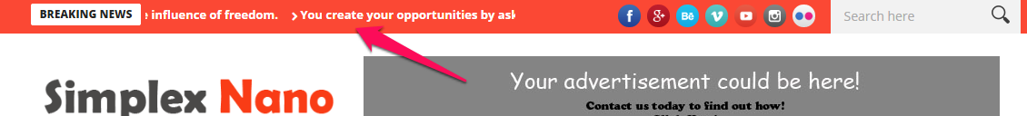
3. To add logo and top navigation
Find this code
<div class='navbar-header'>
                 <div class='container'>
                     <div class='basic-wrapper'>
                        <a class='btn responsive-menu pull-right' data-target='.navbar-collapse' data-toggle='collapse'>
                            <i class='icon-menu-1'/>
                        </a>          
                        <a class='navbar-brand' expr:href='data:blog.homepageUrl'>
                            <img alt='Alt Text' class='retina' src='http://3.bp.blogspot.com/-5AkmGEt7QN8/U7l9wPD14SI/AAAAAAAAAO0/cVE0RtlPQnY/s1600/logo.png'/>
                        </a>
                     </div>
                          <div class='collapse navbar-collapse pull-right'>
                            <ul class='nav navbar-nav' id='menu-standard-navigation'>
                            <li>
                                <a class='dropdown-toggle js-activated' data-toggle='dropdown' href='#' title='Home'>Home</a>
                                <ul class=' dropdown-menu' role='menu'>
                                    <li><a href='#' title='Category'>Category</a></li>
                                    <li><a href='#' title='Category'>Category</a></li>
                                    <li><a href='#' title='Category'>Category</a></li>
                                    <li><a href='#' title='Category'>Category</a></li>

                                </ul>
                            </li>
                            <li>
                                <a class='dropdown-toggle' href='/search/label/gallery?max-results=6' title='Portfolio'>Portfolio</a>
                                

                            </li>
                            <li>
                               <a class='dropdown-toggle' href='/search/label/blog?max-results=6' title='Category'>Blog</a>                                
                            </li>
                            <li>
                                <a class='dropdown-toggle js-activated' data-toggle='dropdown' href='#' title='Category'>About Us</a>
                                <ul class=' dropdown-menu' role='menu'>
                                    <li><a href='#' title='Category'>Category</a></li>
                                    <li><a href='#' title='Category'>Category</a></li>
                                    <li><a href='#' title='Category'>Category</a></li>
                                    <li><a href='#' title='Category'>Category</a></li>

                                </ul>
                            </li>
                            <li>
                               <a class='dropdown-toggle js-activated' data-toggle='dropdown' href='#' title='Category'>Contact Us</a>
                                <ul class=' dropdown-menu' role='menu'>
                                    <li><a href='#' title='Category'>Category</a></li>
                                    <li><a href='#' title='Category'>Category</a></li>
                                    <li><a href='#' title='Category'>Category</a></li>
                                    <li><a href='#' title='Category'>Category</a></li>

                                </ul>
                            </li>                          
                         </ul>                    
                     </div>
                 </div>
             </div>
 Edit the logo url and link in navigation bellow to your logo and links.
Pls note that all links to your label, category which have struction : http://blog url/search/label/ label _name...
must be add this code at the end "?max-results=6"
For examle http://blog url/search/label/blog?max-results=6

4. To edit the header
Find this code:
<!---header -->
                            <div class='col-sm-12'>
                                <b:section id='header1' showaddelement='yes'>
<b:widget id='HTML1' locked='false' title='logo' type='HTML'>
  <b:includable id='main'>
                                            <h1>Hello! We are SimplexDesign</h1>
                                            <div class='lead'>
                                                <p>we love creative ideas and great designs.</p>
                                            </div>
                                            <div class='divide60'/>
                                        </b:includable>
</b:widget>
</b:section>                            
                            </div>
                            <!---end of header -->
You can edit this text in header to whatever you want. You can also remove this part by delete all of this block code.

5. To edit the main slider
Find this code:
<!---Slider -->
                            <div class='col-sm-12'>
                                <b:section id='slider' showaddelement='yes'>
<b:widget id='HTML2' locked='false' title='slider' type='HTML'>
  <b:includable id='main'>   
                                            <div class='ei-slider' id='ei-slider'>
                                                <!--large images go here-->
                                                <ul class='ei-slider-large'>
                                                    <li>
                                                        <img alt='image06' src='http://3.bp.blogspot.com/-OgALPxjVyE4/U7gsjg2wXFI/AAAAAAAAAKo/hV9sdl6YGx8/s1600/1.jpg'/>
                                                        <div class='ei-title'>
                                                            <h2>Passionate</h2>
                                                            <h3>Seeker</h3>
                                                        </div>
                                                    </li>
                                                    <li>    
                                                        <img alt='image01' src='http://3.bp.blogspot.com/-i7rJIQwi_MI/U7gskcAu03I/AAAAAAAAAKw/g4VEtfbBAgU/s1600/2.jpg'/>
                                                        <div class='ei-title'>
                                                            <h2>Creative</h2>
                                                            <h3>Duet</h3>
                                                        </div>
                                                    </li>
                                                    <li>   
                                                        <img alt='image02' src='http://4.bp.blogspot.com/-0Mf5X3ardQo/U7gskeVBIGI/AAAAAAAAAKs/NJhLEypOGGQ/s1600/3.jpg'/>
                                                        <div class='ei-title'>
                                                            <h2>Friendly</h2>
                                                            <h3>Devil</h3>
                                                        </div>
                                                    </li>
                                                    <li>
                                                        <img alt='image03' src='http://2.bp.blogspot.com/--2TaJ7AErnk/U7gskz38zQI/AAAAAAAAAK0/SpCWfoG0V74/s1600/4.jpg'/>
                                                        <div class='ei-title'>
                                                            <h2>Be</h2>
                                                            <h3>Creative</h3>
                                                        </div>
                                                    </li>
                                                    <li>
                                                        <img alt='image04' src='http://3.bp.blogspot.com/-46IyPtuE8ZU/U7gslSsWaWI/AAAAAAAAALA/ByfD9YccNgw/s1600/5.jpg'/>
                                                        <div class='ei-title'>   
                                                            <h2>Insecure</h2>
                                                            <h3>Hussler</h3>
                                                        </div>
                                                    </li>
                                                    <li>
                                                        <img alt='image05' src='http://3.bp.blogspot.com/-nLf6KZ6-GsU/U7gsmERsiwI/AAAAAAAAALM/eeYAzs7yOVY/s1600/6.jpg'/>
                                                        <div class='ei-title'>
                                                            <h2>Loving</h2>
                                                            <h3>Rebel</h3>
                                                        </div>
                                                    </li>                                                   
                                                </ul><!-- ei-slider-large -->
                                                <!--thumbnals go here-->
                                                <ul class='ei-slider-thumbs'>
                                                    <li class='ei-slider-element'>Current</li>
                                                    <li><a href='#'>Slide 6</a><img alt='thumb06' src='http://3.bp.blogspot.com/-OgALPxjVyE4/U7gsjg2wXFI/AAAAAAAAAKo/hV9sdl6YGx8/s150/1.jpg'/></li>
                                                    <li><a href='#'>Slide 1</a><img alt='thumb01' src='http://3.bp.blogspot.com/-i7rJIQwi_MI/U7gskcAu03I/AAAAAAAAAKw/g4VEtfbBAgU/s150/2.jpg'/></li>
                                                    <li><a href='#'>Slide 2</a><img alt='thumb02' src='http://4.bp.blogspot.com/-0Mf5X3ardQo/U7gskeVBIGI/AAAAAAAAAKs/NJhLEypOGGQ/s150/3.jpg'/></li>
                                                    <li><a href='#'>Slide 3</a><img alt='thumb03' src='http://2.bp.blogspot.com/--2TaJ7AErnk/U7gskz38zQI/AAAAAAAAAK0/SpCWfoG0V74/s150/4.jpg'/></li>
                                                    <li><a href='#'>Slide 4</a><img alt='thumb04' src='http://3.bp.blogspot.com/-46IyPtuE8ZU/U7gslSsWaWI/AAAAAAAAALA/ByfD9YccNgw/s150/5.jpg'/></li>
                                                    <li><a href='#'>Slide 5</a><img alt='thumb05' src='http://3.bp.blogspot.com/-nLf6KZ6-GsU/U7gsmERsiwI/AAAAAAAAALM/eeYAzs7yOVY/s150/6.jpg'/></li>
                                                   
                                                </ul><!-- ei-slider-thumbs -->
                                            </div><!-- ei-slider -->
                                        </b:includable>
</b:widget>
</b:section>   
                            </div>
                            <!---end of slider -->
All things need to change marked in bold. You can change it to your images and thumbnails.

6. Under the slider is advertisment blocks
To edit, find this code:
<!--- advertise-->
                            <b:section id='adv1' showaddelement='yes'>
<b:widget id='HTML3' locked='false' title='adv1' type='HTML'>
  <b:includable id='main'>
                                        <div class='col-sm-3'>   
                             <div class='text-center services-1'>
                                <div class='col-wrapper'>
                                    <div class='icon-border bm15'> <i class='icon-picons-bulb'/> </div><h5 class='upper'>Creative Ideas</h5><p>Nulla vitae libero pharetra augue. Etiam porta malesuada magna mollis euismod consectetur sem urdom tempus porttitor.</p>
                                </div>
                             </div>   
                         </div>
                                        <div class='col-sm-3'>   
                            <div class='text-center services-1'>
                                <div class='col-wrapper'>
                                    <div class='icon-border bm15'> <i class='icon-picons-rocket'/> </div><h5 class='upper'>Rapid Solutions</h5><p>Nulla vitae libero pharetra augue. Etiam porta malesuada magna mollis euismod consectetur sem urdom tempus porttitor.</p>
                                </div>
                            </div>
                         </div>
                                        <div class='col-sm-3'>   
                            <div class='text-center services-1'>
                                <div class='col-wrapper'>
                                    <div class='icon-border bm15'> <i class='icon-picons-lab'/> </div><h5 class='upper'>Magic Touch</h5><p>Nulla vitae libero pharetra augue. Etiam porta malesuada magna mollis euismod consectetur sem urdom tempus porttitor.</p>
                                </div>
                            </div>
                        </div>
                                        <div class='col-sm-3'>   
                            <div class='text-center services-1'>
                                <div class='col-wrapper'>
                                    <div class='icon-border bm15'> <i class='icon-picons-award'/> </div><h5 class='upper'>AWARD WINNING</h5><p>Nulla vitae libero pharetra augue. Etiam porta malesuada magna mollis euismod consectetur sem urdom tempus porttitor.</p>
                                </div>
                            </div>
                        </div>
                                    </b:includable>
</b:widget>
</b:section>
                            <!---end of advertise -->
You can edit content as you want.

7. To edit Customer testimonial part
Find this code
<!---Customer testimonial -->       
                <div class='parallax' style='background-image: url(http://tlnap38wsaf2tcqwj2unvg2uq0.wpengine.netdna-cdn.com/wp-content/uploads/2014/03/parallax1.jpg);'>
                <div class='container inner'>
                    <div class='row'>
                        <div class='col-sm-12'>       
                            <div class='section-title-wrapper'>
                                <h3 class='section-title'>What our customers think</h3>
                            </div>
                        </div>
                        <div class='col-sm-12'>           
                            <div class='text-center'>
                                <div class='tab-container' id='testimonials'>                           
                                    <div class='panel-container'>           
                                        <div class='' id='tst1'>Cras justo odio, dapibus ac facilisis in, egestas eget quam. Maecenas faucibus mollis interdum. Vivamus sagittis lacus vel augue laoreet rutrum faucibus dolor auctor gravida at eget metus. Vestibulum id ligula porta.<span class='author'>Elsie Spear</span> </div>
                                        <div class='' id='tst2'>Aenean eu leo quam. Pellentesque ornare sem lacinia quam venenatis vestibulum. Donec sed odio dui. Sed posuere consectetur est at lobortis. Maecenas faucibus mollis interdum. Aenean lacinia bibendum nulla sed.<span class='author'>Barclay Widerski</span> </div>
                                        <div class='' id='tst3'>Praesent commodo cursus magna, vel scelerisque nisl consectetur et. Nullam id dolor id nibh ultricies vehicula ut id elit. Maecenas faucibus mollis interdum. Praesent commodo cursus magna. Donec sed odio dui.<span class='author'>Coriss Ambady</span> </div>
                                        <div class='' id='tst4'>Praesent commodo cursus magna, vel scelerisque nisl consectetur et. Nullam id dolor id nibh ultricies vehicula ut id elit. Maecenas faucibus mollis interdum. Praesent commodo cursus magna. Donec sed odio dui.<span class='author'>Nikolas Brooten</span> </div>               
                                    </div>           
                                    <ul class='etabs'>
                                        <li class='tab'><a class='' href='#tst1'/></li>
                                        <li class='tab'><a class='' href='#tst2'/></li>
                                        <li class='tab'><a class='' href='#tst3'/></li>
                                        <li class='tab'><a class='' href='#tst4'/></li>       
                                    </ul>
                                </div>
                            </div>
                        </div>
                    </div>
                 </div>
                </div>
                <!--end of testimonial-->
You can edit customer testimonial in this code as you want. This url "http://tlnap38wsaf2tcqwj2unvg2uq0.wpengine.netdna-cdn.com/wp-content/uploads/2014/03/parallax1.jpg" is background of customer testimonial part. You can change this to your background image.

8. To edit key feature
Find this code:
<!---Key features -->   
                <div class='dark-wrapper'>
                 <div class='container inner' style='padding-bottom: 0px;'>
                     <div class='row'>
                        <div class='col-sm-12'>       
                            <div class='section-title-wrapper'>
                                <h3 class='section-title'>Key Features of Simplex&#39;s templates</h3>
                            </div>
                            <div class='thin'>
                                <div class='text-center'>
                                    <p>Cum sociis natoque penatibus et magnis dis parturient montes, nascetur ridiculus mus. Integer posuere erat a ante venenatis dapibus posuere velit aliquet. Maecenas sed diam eget risus varius blandit sit amet non magna posuere velit aliquet.</p>
                                </div>
                                <div class='divide40'/>
                            </div>
                        </div>
                        <div class='aq-block aq-block-aq_icon_multiple_block col-sm-3 aq-first '>       
        <div class='services-2'>
       
                       
                <div class='icon'>
                    <i class='icon-picons-desktop-preferences icn'/>
                </div>

                <div class='text'>
                    <h5 class='upper'>100% Responsive Layout</h5><p>Nulla vitae libero, a pharetra augue. Integer posuere a ante venenatis condimentum.</p>
                </div>
               
            <div class='divide20'/>           
                <div class='icon'>
                    <i class='icon-picons-support icn'/>
                </div>

                <div class='text'>
                    <h5 class='upper'>Free Support &amp; Updates</h5><p>Nulla vitae libero, a pharetra augue. Integer posuere a ante venenatis condimentum.</p>
                </div>
               
            <div class='divide20'/>           
                <div class='icon'>
                    <i class='icon-picons-drawing icn'/>
                </div>

                <div class='text'>
                    <h5 class='upper'>Pixel Perfect Design</h5><p>Nulla vitae libero, a pharetra augue. Integer posuere a ante venenatis condimentum.</p>
                </div>
               
                   
        </div>
       
    </div>
                        <div class='aq-block aq-block-aq_image_block col-sm-6'>               
               
            <img alt='aq_block_19' src='http://tlnap38wsaf2tcqwj2unvg2uq0.wpengine.netdna-cdn.com/wp-content/uploads/2014/04/loom-browser.png'/>
       
               
    </div>
                        <div class='aq-block aq-block-aq_icon_multiple_block col-sm-3  '>       
        <div class='services-2'>
       
                       
                <div class='icon'>
                    <i class='icon-picons-window-layout-3 icn'/>
                </div>

                <div class='text'>
                    <h5 class='upper'>Rich Layout Options</h5><p>Nulla vitae libero, a pharetra augue. Integer posuere a ante venenatis condimentum.</p>
                </div>
               
            <div class='divide20'/>           
                <div class='icon'>
                    <i class='icon-picons-earth icn'/>
                </div>

                <div class='text'>
                    <h5 class='upper'>SEO Friendly</h5><p>Nulla vitae libero, a pharetra augue. Integer posuere a ante venenatis condimentum.</p>
                </div>
               
            <div class='divide20'/>           
                <div class='icon'>
                    <i class='icon-picons-brush-2 icn'/>
                </div>

                <div class='text'>
                    <h5 class='upper'>Colour Palates</h5><p>Nulla vitae libero, a pharetra augue. Integer posuere a ante venenatis condimentum.</p>
                </div>
               
                   
        </div>
       
    </div>
                    </div>
                 </div>
             </div>
                <!---end of Key features -->
Edit it as you want. To remove it out, only delete this block code.

9. Our process part
 To edit, find this code
<!---Our process -->
                <div class='parallax' style='background-image: url(http://tlnap38wsaf2tcqwj2unvg2uq0.wpengine.netdna-cdn.com/wp-content/uploads/2014/03/parallax2.jpg);'>
                <div class='container inner'>
                    <div class='row'>
                        <div class='col-sm-12'>       
                            <div class='section-title-wrapper'>
                                <h3 class='section-title'>Our Process</h3>
                            </div>
                            <div class='thin'>
                                <div class='text-center'>
                                    <p>Consectetur adipiscing elit. Cum sociis natoque penatibus et magnis dis parturient montes, nascetur ridiculus mus. Etiam porta sem malesuada magna mollis euismod. Praesent commodo cursus magna, vel scelerisque nisl consectetur et.</p>
                                </div>
                                <div class='divide40'/>
                            </div>
                        </div>
                        <div class='col-sm-12'>       
                            <div class='row services-3 text-center'>
                                <div class='col-sm-3 col'>
                                    <div class='icon'><i class='icon-picons-bulb icn'/></div>
                                    <h4 class='upper'>1. Creative Ideas</h4>
                                </div>
                                <div class='col-sm-3 col'>
                                    <div class='icon'><i class='icon-picons-rocket icn'/></div>
                                    <h4 class='upper'>2. Rapid Solutions</h4>
                                </div>
                                <div class='col-sm-3 col'>
                                    <div class='icon'><i class='icon-picons-lab icn'/></div>
                                    <h4 class='upper'>3. Magic Touch</h4>
                                </div>
                                <div class='col-sm-3 col'>   
                                    <div class='icon'><i class='icon-picons-award icn'/></div>
                                    <h4 class='upper'>4. Award Winning</h4>
                                </div>
                            </div>
                        </div>
                    </div>
                </div>
             </div>
                <!---end of our process -->
10. To edit Call to action message
 Find this code:
<!---call to action -->
                <div class='dark-wrapper'>
                <div class='container inner'>
                    <div class='row'>
                        <div class='col-sm-12'>       
                            <div class='text-center'>
                                <p class='lead lite'>
                                    <a href='#'>If you like what you see, let&#39;s work together</a>
                                </p>
                            </div>
                         </div>
                     </div>
                 </div>
             </div>
                <!---end of call to action -->
11. To edit the post author at the end of each post
Find and edit this code
<!--post author-->
                                                            <div class='about-author image-caption'>
                                                            <div class='author-image'>
                                                                <img alt='' class='avatar avatar-120 photo' height='120' src='http://1.gravatar.com/avatar/bb43b8611ea6edf1a25c2abdc0a7285f?s=120&amp;d=http%3A%2F%2F1.gravatar.com%2Favatar%2Fad516503a11cd5ca435acc9bb6523536%3Fs%3D120&amp;r=G' width='120'/>
                                                            </div>
                                                            <div class='author-details vcard author'>
                                                                <h3>
                                                                    About the author   
                                                                </h3>
                                                                <p>Huy Dinh Quang (known as Nhamngahanh) is a blogger and founder of Simplexdesign blog . Learn more about him <a href='http://www.thesimplexdesign.com/p/about-me.html'>here</a> and connect with SimplexDesign community in <a href='http://twitter.com/dinhquanghuy'>Twitter</a>,<a href='http://www.facebook.com/simplexdesignblog'>Facebook</a>,and <a href='https://plus.google.com/u/0/106038766758854870457?rel=author'>Google+</a></p>
                                                                <ul class='social'>
                                                                    <li><a href='#' target='_blank'><i class='icon-s-pinterest'/></a></li>
                                                                    <li><a href='#' target='_blank'><i class='icon-s-facebook'/></a></li>
                                                                    <li><a href='#' target='_blank'><i class='icon-s-twitter'/></a></li>
                                                                    <li><a href='#' target='_blank'><i class='icon-s-linkedin'/></a></li>
                                                                    <li><a href='#' target='_blank'><i class='icon-s-skype'/></a></li>
                                                                    <li><a href='#' target='_blank'><i class='icon-s-dribbble'/></a></li>
                                                                </ul>
                                                            </div>
                                                            <div class='clearfix'/>
                                                         </div>
12. To edit the sidebar :
Find this code
<!--sidebar-->
                                                        <aside class='col-sm-4 sidebar lp30'>
                                                            <div class='sidebox widget widget_search' id='search-2'>
                                                                <form action='/search' class='searchform' id='searchform' method='get'>
                                                                    <input class='search' id='s2' name='q' onblur='this.value=&apos;Search something&apos;' onfocus='this.value=&apos;&apos;' type='text' value='Search something'/>
                                                                    <button class='btn btn-default' type='submit'>Find</button>
                                                                </form>
                                                            </div>
                                                            <div class='sidebox widget ebor_popular' id='ebor_popular-widget-3'>
                                                                <h3 class='widget-title'>Recent Posts</h3>
                                                                <ul class='post-list'>
                                                                    <script>
                                                                        document.write(&quot;&lt;script src=\&quot;/feeds/posts/default/-/blog?max-results=6&amp;orderby=published&amp;alt=json-in-script&amp;callback=showrecentposts3\&quot;&gt;&lt;\/script&gt;&quot;);
                                                                    </script>
                                                                </ul>
                                                            </div>
                                                             <!--sidebar ads code go here-->
                                                         </aside>
                                                        <!--end of sidebar-->
 You can start add your ad code after the bold text "sidebar ads code go here"

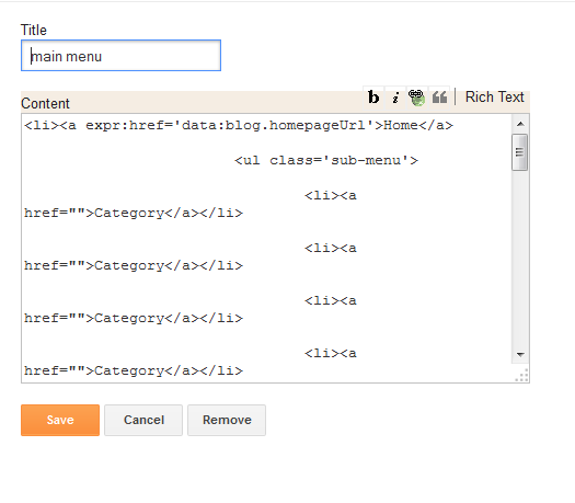
13. To edit footer link
Find this code
<ul class='footer-menu pull-right' id='menu-footer-menu'>
                        <li><a href=''>Home</a></li>
                        <li><a href='/search/label/gallery?max-result=6'>Portfolio</a></li>
                        <li><a href=''>About</a></li>
                        <li><a href='/search/label/blog?max-result=6'>Blog</a></li>
                        <li><a href=''>Contact</a></li>
                    </ul>
Edit it as you want.

That's all for editing. Save template and it ready to use.

Usage

This template has two types of post, one is normal blog post

and the other is portfolio post

To make a post display as a normal blog post, just add label "blog" to its label list


And to make it display as portfolio post, add label "gallery"
 One post have must have one label "blog" or "gallery". If have no label "blog" or "gallery", the post cannot display. If it has both of label "blog" and "gallery", it will make error for all site.

That's all for this template. It is free for download and use. Thanks for your support all the time.

I'm available for hire at 10$ if you want to install this template as good as live demo. Pls check contact at "contact us" or "hire us" page.


11 Signs of Lazy Web Design

$
0
0
We have come a long way from the time when artists used to paint with water colors and brushes. Then their web designer descendants picked up the mouse and battled with technology to create rudimentary websites in the 90s. Today slick, stunning websites are only a few drags and drops away. With no artistic skills, no web development chops, and just WYSIWYG editors, everybody has turned into a budding designer.
Though HTML5, CSS, source code packages and so-called Dreamweavers have made our digital lives much simpler, they have also made us lazier. The attention to detail that the early web developers gave to each line of HTML code, each frame they created for a website, each color and font that they handpicked for their pet projects, is sorely missed today. Here’s a look at the top 11 signs that you’re a culprit of lazy web design.

1.    Helvetica

Now that Helvetica has been anointed as the ‘it’ typeface for digital applications by leading design gurus, designers or wannabe designers no longer bother experimenting with what typefaces will suit their site or brand the best.
It’s a blind beeline towards Helvetica, hence diluting the charm of that once singular typeface.

2.    Stock photos

Each time you stumble onto a site with two people in business suits smiling and shaking hands with each other, you can rest assured the designer has not bothered to venture beyond the first page of Getty Images or ShutterStock for their image needs.
Yes, stock photos are necessary and way cheaper than a custom photo shoot, but there’s a whole world of brilliant stock images out there. If you only care to look around. Check out Pixabay or Gratisography for some stunning free to use images.

3.    Boring layouts made from templates

With the same 5 templates from WordPress doing the rounds everywhere you turn, there IS such a thing as too much of a good thing. It may be tempting to pick a readymade, popular template for the layout of your website. Saves time, saves effort. Often it’s free so it even saves you some money.
But think about it like a visitor. Would YOU seek out a site that looks exactly like thousands of others on the net or would you rather spend your time on a uniquely designed, information rich site?

4.    ‘Click here’

Probably the most overdone button in the history of the internet, ‘Click Here’ has the unique distinction of being wildly popular in spite of conveying almost no real call to action to the user.
Ditch this lazy option for more descriptive buttons that actually tell the user what to expect once they click on them. Something like ‘Proceed to Checkout’ or ‘Download Now’ convey a message while still providing the click functionality.

5.    Auto-play music and videos

Videos are a popular feature of many websites, even on the home page. While there’s absolutely nothing wrong with that, as a designer, you must respect the fact that most users are multi-tab, mobile internet users who are probably at work or on a bus or a train while accessing your website.
Embarrassing them with loud sound that starts by itself when your site opens up is a 100% fool-proof way of ensuring that they close your site tab as soon as they possibly can.

6.    Large blocks of text

Sure, your job is to design; not write copy. But the final product – the website – is entirely your baby, right? In that case, drop your laziness and READ the copy before pasting it mindlessly into your web design.
Prune the copy to make it more readable. Adapt it to suit your design. Better still, adapt your design to suit the copy.

7.    Overuse of animation

Flash intros were not popular with customers even in the era when they were widely used across many websites. They were slow to load, conveyed little or no information and used up precious bandwidth in the pre-broadband age.
Drop your flash intros today. They’re outdated, tacky, do not play on Apple devices and do not add any real value to your site.

8.    Endless checkout process

A checkout process that meanders all over the place, asks for the same information twice (first billing address, then shipping address), asks for useless, irrelevant information is a checkout process into which very little thought was put into, from a design perspective.
In an age where there are ultra-simple iPad based POS systems like Vend in real world stores, having convoluted checkout processes in an ecommerce set up is unforgivable.

9.    No mobile version, non-responsive design

With smartphone access to websites now officially overtaking access from desktops, not having a mobile version of your site is simply irresponsible. The ideal scenario would be a responsive web design which works great across all devices, but the very least in this case would be a mobile optimized site at the very least.

10.    Not optimized for search

Lazy designers / developers are to blame for the most part for the terrible SEO capabilities most of the sites on the internet are born with. This includes no Alt Tags on images, none or very perfunctory meta data for the page, not using keywords in important areas of the page like the header tag, meta description, title tag, URL and more.

11.    No testing

Designers who subscribe to the ‘build it and forget it’ school of thought do a major disservice to their websites. Whether build up from scratch or using a drag and drop editor, ALL websites need to be rigorously tested before being formally launched. This prevents rookie errors that may have gone unnoticed and led to lower conversions eventually.
Use a comprehensive testing tool like Optimizely to check every aspect of your site before you take it live.

Is that All?

This list is probably just scratching the surface of the many, many shortcuts that web designers resort to, just to cut corners and turnaround a project in record time. As a site owner you job is to watch for these issues and prevent them from happening. If you’re a web designer, you know exactly what I’m talking about here: Time to switch from auto-pilot to your A-Game!

About Guest Blogger

Lori Wagoner is an independent content strategist who gives online marketing advice to small businesses. Lori has blogged at Tweak Your Biz, The Social Media Hat and many other business and tech blogs. You can reach her @LoriDWagoner on Twitter.

7 Critical Errors Your Web Design Could Be Hiding

$
0
0
So you have a website that brings you compliments by the dozen on a regular basis? You are proud of the aesthetic elements it sports and are happy with the conversions that it gives your business.
But what if I told you that it could all be even better? You could improve your conversions and build your brand cachet by avoiding some fundamental, yet often overlooked mistakes that plague most website designs?
Sounds interesting? Read on in that case!

1. Not Browser Agnostic

In our bid to make our website design as aesthetic as possible, we sometimes overlook the fact that the need to be functional is sometimes more important than the need to be aesthetically pleasing. Many web designers create their pieces of art with only the most popular or worse, their personal favourite web browser in mind. A common suspect that often gets left out is IE, especially older versions of it.
Don’t make this rookie mistake. You don’t want to be a ‘browser racist’ and close the doors of your site to users who use less popular browsers. Write browser agnostic code that works equally well on all browsers. Avoid including special plugins like ActiveX on certain browsers to avoid compatibility issues. Most importantly, carry out regular tests of your site on various versions of each browser family to ensure it displays well on all (or most) of them.
Better still, opt for drag and drop website tools like IM Creator or Wix that will automatically take care of these browser compatibility issues for you. Creating a level playing field will maximize your opportunities of converting a potential customer using any particular browser.

2. iFrames, Flash and Shoddy CSS

Try and avoid using iframes as much as you can – they load poorly on many browsers and slow down the site load time considerably. If you must use iframes, make sure they are titled to ensure the user knows what it’s about even if it does not load.
Flash is another idea whose time is past. Not only does HTML5 do a much better job of what flash can offer your website, it is also compatible across browsers and devices, unlike flash. No other option for this – just avoid it.
CSS with its deceptively simple looking code, can sometimes confound browsers on how to display your website correctly. Avoid lazy CSS coding like using color names instead of the exact hex value of the colour you want to use or not having fall back fonts for older computers that don’t have that exact font you selected installed on it. Doing this prevents putting control of the how your website looks to the mercy of a web browser and keeps it firmly in your hands.

3. Messed Up URL Structures

Creating logical URL structures with categories, sub categories and product names/ IDs showing clearly helps not just the user to navigate better around your site using it or to pick your site from a SERP, it also helps improve rankings by guiding search spiders with clear instructions on what the page is all about.
A URL structure that looks like this is what you need to avoid:
http://www.overstock.com/search?keywords=&taxonomy=cat4541&sortOption=Top+Sellers
Something that’s closer to this is what you want to aim for: http://www.sugarcrm.com/products/marketing

4. Contact Details Not Visible

Many e-commerce companies shy away from giving out too many points of contact apart from their 1800 – toll free number in the fear of being plagued by customer calls and messages constantly.
Bad idea. When you put up your contact details upfront where any customer can see them, it instils faith in a customer’s mind that you are reachable should anything go wrong with the purchase.
Non-ecommerce companies must have their contact number and / or email IDs displayed prominently upfront to get more leads and convert the ones that were already far along the sales funnel.
This could be better:

This is what you need to do:

5. Social Sharing Missing

Social media is the lifeblood of the internet today. Most people spend more time on social media than on any other online pursuit. Sharing cool finds online with their peer network makes people feel important and appreciated.
Feed into this basic human need for appreciation by bringing social media onto your site. Ensure every page on your site has social sharing buttons to enable quick sharing. Also, in case of e-commerce sites, allow sharing product level images and information to create social conversations about your product and brand.

6. Search Bar Not Easy to Find

This is a true irony if there ever was one. When customers have something very specific in mind, they prefer to simply type it in, into the search bar than navigate through the different sections of your site hunting for what they want.
No matter how well designed your navigation is, invest in a search bar in a prominent location on your site. If you think your design does not permit you to have a full-fledged search bar, use a collapsible search bar that serves the twin purposes of saving space and offering regular search capabilities.

7. Fonts Not Readable

While web designers spend hours mulling over the best layout or the most effective color combinations; they give little thought to the typefaces they’ll be using across the site.
With most websites, 80% of the content is in text form. So if your website has to convey information efficiently, it has to have clear, legible, yet attractive fonts that communicate crystal clear to users.
The size of the fonts used is a another matter of concern oft overlooked. For best readability, use 16 pixels at least for your web copy, as per studies conducted on the subject.
Space out your text well enough to prevent cluttering your core message by overcrowding it out of comprehension. Use contrast in choosing your font colors vis-à-vis the background you picked for the site. A combination of dark colored font against light colored backgrounds works best from a readability perspective.

Am I Missing Something?

Web design does not have to be rocket science. With a little bit of care and a lot of patience it is definitely possible to create and market winning web designs. The next time you do a site audit or when you’re building your site from scratch, make sure you don’t make the silly but significantly important errors I pointed out above.
Do you know of more such design faux pas that we unwittingly hardwire into our sites? Share your ideas here and help the rest of the community develop their skills and design more efficient websites that have the added advantages of being easy on the eye while still being user friendly.

About Guest Blogger

 Lori Wagoner is an independent content strategist who gives online marketing advice to small businesses. Lori has blogged at Tweak Your Biz, The Social Media Hat and many other business and tech blogs. You can reach her @LoriDWagoner on Twitter.

Good Design is Not Just for Websites

$
0
0
A design isn’t finished until somebody is using it. ~ Brenda Laurel

Design is where science and art break even. ~ Robin Mathew

These are just two of the many quotes on design, and they all try to make a point: design isn’t just “design.”

There’s more to it.

Say the word “design” today and you’d think websites. At best, you’d think graphics. Of course, there’s product design, interior design, and many other forms of design but we’ll stick to digital forms for the purposes of this post.

Good design isn’t just in the art galleries; it is everywhere, as the folks at Build Blog attest to. For digital marketers and business owners looking to embrace the web’s potential, design might just be about websites: the layouts, the UX/UI, the colors, and the various elements that go into it.

But even that kind of design has evolved: At first, it was about HTML pages. Then we got embedded objects and flash. More recently, responsive design came along. Slowly, mobile design took center stage, and now the focus is on people. (Did we just come full circle?)

Today, it’s not mobile, websites, or design itself; it’s about the customer. It was always the customer. We took a while – and a lifetime of Internet usage – to arrive at that simple realization.

Natasha Hritzuk is Microsoft’s senior director of global insights and the co-author of Multi-screen Marketing: The Secen Things You Need to Know to Reach Your Customers across TVs, Computers, Tablets and Mobile Phones. In an interview with Amy Gesenhues of Marketing Land she insists on marketers to take a holistic approach to marketing.

So, what’s the fuss about design? If it’s not about websites, what’s it about? From a digital marketing perspective, it’s about these:

Good design is about respecting customers

If users have to pinch, zoom, squint, and click more than twice to get at anything on your website, you’ve just put up a horrendous website. You are shamelessly making users go through hoops to get to something that should have been just a click away.

Do you see where the “respect” part wedges itself into design? Good design respects end users. Simplicity and attention to detail sit at the core of good design. Utility takes a new meaning (and will change as web access points grow) and navigation becomes standard.

Don’t make customers work hard to get to you. In case you haven’t realized, it’s already hard to get customers, even online.

Responsive design is only the beginning

Don’t get hung up on responsive design. Of course, it’s important that your website fits nice and square on any device it’s displayed on. You already know that, don’t you?

It’s not just websites that have to go responsive. Email marketing demands responsive email design, and is already getting it. So are paid advertisements. Meanwhile, social networks are already mobile-friendly.

This is today, but the future is already set up. There are wearable devices and pretty soon we’ll have screens in the air, which will whip up visuals, video and text from gestures and brain signals, for all we know.

Responsive design addresses a current need to be customer friendly. You come back to the “customer” more often than you care about.

The meaning of design just got extended

It’s really not about the design of web elements anymore. So, in effect, it’s not about a website, a landing page, a thank you page, or any other page you put up. It’s about how each of these elements relate to the others.

How do your social media buttons on the website link to your social accounts? What shows up on the top of your home page? Where is the opt-in form I was looking for?

If you thought that “Hello bar” was great for conversions, what happens when the site is displayed on a mobile device? What’d happen if you add another bar near the footer area?

Anything you do, or don’t, will affect your primary goal. Additional bars on footers could destroy mobile experience. Social media buttons sliding to the right might block the entire site when viewed on a mobile phone.

Design is about getting it all together

As far as digital marketing is concerned, good design requires you to manage your customers’ multiple touch points on the web.

Starting from responsive web design to how your emails look, and from how your opt-in forms work to what’s visible on your social accounts.
Marketing automation helps in getting your act together and takes a bit of that hard work away, but even automation requires planning, strategy, and effort.

Good design is understanding of your customers’ plight

No one gets up one fine morning hoping to get into someone’s marketing funnel.

Your customers are a hassled lot. They are bombarded with tons of messages, information, and choices. Plus they have their own insecurities and worries to boot. Good design brings marketing, technology, and a bit of our own conscience. It demands that we sympathize with our customers’ pain and make purchasing easy on them.

To wrap up

In summary, here’s what good design is about:
  • It’s not about websites, it’s about user experience.
  • It’s about being ready for what’s in demand. Today, it’s responsive design. Is tomorrow about wearable compatibility?
  • Design extends its reach into making for customers. It’s about paving the roads to easy business. It’s about bringing information, solutions, and products into their hands.
  • Good design brings technology and marketing together. It brings intent and utility to the same platform. It connects things for you as a business, and for your customer who is looking for solutions to her problems.
  • Finally, it’s about being nice. Make way for some basic courtesy. Let your customers determine whether they want to do business with you.

What do you think good design is about? Do you agree that it’s about customer experience today and not so much about mobile design, website design, and other such things we tend to worry so much about?

About Guest Blogger

 Lori Wagoner is an independent content strategist who gives online marketing advice to small businesses. Lori has blogged at Tweak Your Biz, The Social Media Hat and many other business and tech blogs. You can reach her @LoriDWagoner on Twitter.

Create a gallery inside your post using Justified Gallery

$
0
0
Are you photographer or photo blogger whose blog specific in pictures ? Do you often have blog posts with many pictures inside and it's look messy ?
I have a personal blog which sharing thoughts and experiences. There are many pictures inside each post and it's very hard to read. After that, I found a Jquery plugin name Justified Gallery and it helped me a lot. All the pictures in a post are now organized in a small "gallery" block.
You can take a look here
test1test2test3test4

How to do this ?
1. Download two files :justifiedGallery.cs and jquery.justifiedGallery.js, then upload to your own hosting. One of the best option is to use Google Drive as a hosting.
2. Open a posts which you want to insert gallery and then switch to edit HTML mode
3. Paste these two lines at the begining of post
<link href='https://0e6db9c931da7428dddf1c2982bd659bcc6c5064.googledrive.com/host/0B7DKPL3_p49OYW9YLU82WFQ4bDQ/justifiedGallery.css' media='all' rel='stylesheet' type='text/css'/>
<script src='https://c8c1ed4510ebdccc6db55eeae4c29898e8cc77ee.googledrive.com/host/0B7DKPL3_p49OWE1vaEo2UXJFamM/jquery.justifiedGallery.min.js' type='text/javascript'></script>
<link href='https://ccc3505569e76261040e28ae00cd8755b0594cd6.googledrive.com/host/0B7DKPL3_p49OUGNaeWJ3Tm1OUXM/colorbox.css' media='screen' rel='stylesheet' target='_blank'/>
<script language='javascript' src='https://451fd940c1c6a3dc714af3ba08b0a04e2f69264f.googledrive.com/host/0B7DKPL3_p49OV1U1d0FoV2RQUUk/colorbox.js'></script>
4. Continue writing the post, in the place where you want to insert a gallery, upload pictures to Blogger, and then add them all to the post content.
5. Edit the code of pictures which inserted to make them look like that

<div class="colorboxEx">
<a title="Title 1" href="https://www.blogger.com/path/to/myimage1_original.jpg">
<img alt="Title 1" src="path/to/myimage1_t.jpg" />
</a>
<a title="Title 2" href="https://www.blogger.com/path/to/myimage2_original.jpg">
<img alt="Title 2" src="path/to/myimage2_t.jpg" />
</a>
<!-- other images... -->
</div>
6. Finish the post and add this code at the end of your post

<script>
jQuery(document).ready(function () {
jQuery(".colorboxEx").each(function (i, el) {
jQuery(el).justifiedGallery({rel: 'gal' + i}).on('jg.complete', function () {
jQuery(this).find('a').colorbox({
maxWidth : '80%',
maxHeight : '80%',
opacity : 0.8,
transition : 'elastic',
current : ''
});
});
});
});
</script>
Save the post and see the result. You can see your post look very clean and clear.

Simplex PhotoIV - A new template for photographer

$
0
0
It's been 5 years since the first day of SimplexDesign. We have many templates published. And now, as usual, another template. This one name Simplex Photo IV, the latest one in serie of templates for photographer to show their showcase. Hope it helpful to you all.


Live Demo | Download | Sample Data

Install instruction

1. Download template file

2. Open template file in a word editor such as Notepad++

3. To edit main menu, find this code

    <ul class='menu' id='menu-main-menu'>
                        <li><a expr:href='data:blog.homepageUrl'>Home</a>
                            <ul class='sub-menu'>
                                <li><a href=''>Category</a></li>
                                <li><a href=''>Category</a></li>
                                <li><a href=''>Category</a></li>
                                <li><a href=''>Category</a></li>                               
                            </ul>
                        </li>
                        <li><a href='/search/label/gallery'>Photo</a>
                            <ul class='sub-menu'>
                                <li><a href=''>Category</a></li>
                                <li><a href=''>Category</a></li>
                                <li><a href=''>Category</a></li>
                                <li><a href=''>Category</a></li>                                               
                            </ul>
                        </li>
                        <li><a href='/search/label/blog'>Blog</a>
                            <ul class='sub-menu'>
                                <li><a href=''>Category</a></li>
                                <li><a href=''>Category</a></li>
                                <li><a href=''>Category</a></li>
                                <li><a href=''>Category</a></li>                                               
                            </ul>
                        </li>
                        <li><a href='/p/about.html'>About us</a></li>
                    </ul>

Edit the link in code above to make sure it link to your labels, categories in your blog. Normally, structure of a label link is as following:
http://blogname.blogspot.com/search/label/label_name

4. After finish editing, save template and then upload to Blogger

5. Go to Blogger Dashboard -> Layout

6. To edit Header logo

Click on edit link in SimplexPhotoIV (Header) widget

In widget dialog, upload your logo and choose the option "Instead of title and description"

7. To edit header social network

Click on edit link in header social network

Paste the following code into widget content, please remember to edit the link to your social accounts:

<a href='1'><i class='fa fa-rss'/></i></a>
                        <a href='#'><i class='fa fa-dribbble'/></i></a>
                        <a href='#'><i class='fa fa-facebook'/></i></a>
                        <a href='#'><i class='fa fa-linkedin'/></i></a>
                        <a href='#'><i class='fa fa-pinterest'/></i></a>
                        <a href='#'><i class='fa fa-twitter'/></i></a>

8. To edit main menu

Click on edit link in main menu widget

Copy and paste the code from step 2 into widget content

9. To show content in homepage

Click on edit link in Feature widget

Add the label name which you want to show posts, for example, I want to show latest posts under "gallery" label in homepage, I add the label name "gallery" into widget content. Please note that name of label is case sensitive.

10. Under Blog Posts widget, you will see a widget name Sidebar, it's a widget that contain search form, recent posts and recent comments function in the sidebar. You can add/remove any widget here. The widget added will be shown in the sidebar.

How to use this template

There are two type of Blog post display support in this template. One is photo post

And the other display like a normal blog post.

To create a photo post, just create a post as normal and then add the label "gallery".

To create a blog post, create a post as normal and then add the label "blog"
That's all.

Note
To make it easier for you, I already added a sample blog data file (xml format). This data file is extracted from my demo blog. So you can download and then import to your blog to make one site like my live demo.
(By going to Blogger Dashboard -> Other -> Import Blog -> Click Browse and then choose sample blog data file -> Check "Automatically publish all imported posts and pages" and then click Import Blog )

Filter a list in your post using InstaFilta

$
0
0

In some blog, I see people have a long list in their post (for example a list of name). It's very hard for users to scan through the data in this list to find what they are interested in. And I found a plugin name InstaFilta. It's the best choice in this case with a text field to perform in-page filtering. Just enter some character of what you are looking for, non-matching items will be hidden.

You can see demo here

How to add this one to a post/page of my blog ?

1. Open Blogger Dashboard -> Create a new Blog Post -> Click HTML to switch to edit HTML mode. After this step, all the code are added into post content

2. First, we need a list of data in your site and a text field for in-page filtering. This is an example of HTML markup and text field:


<input type="text" id="instafilta-field" placeholder="Type to filter">

<div class="section1">
<h2 class="section-title">A</h2>
<ul class="section-list">
<li class="section-item">Amy</li>
<li class="section-item">Anakin Skywalker</li>
<li class="section-item">Albert</li>
<li class="section-item">Andy Panda</li>
</ul>
</div>

<div class="section1">
<h2 class="section-title">B</h2>
<ul class="section-list">
<li class="section-item">Bob</li>
<li class="section-item">Bonnie</li>
<li class="section-item">Boogie Woogie</li>
<li class="section-item">Barry</li>
</ul>
</div>

<div class="section1">
<h2 class="section-title">C</h2>
<ul class="section-list">
<li class="section-item">Carrie Bradshaw</li>
<li class="section-item">Carl</li>
<li class="section-item">Cindy</li>
<li class="section-item">Cameron</li>
<li class="section-item">C-3PO</li>
</ul>
</div>

<div class="section1">
<h2 class="section-title">D</h2>
<ul class="section-list">
<li class="section-item">Dave</li>
<li class="section-item">Daryl</li>
<li class="section-item">Donna</li>
<li class="section-item">Danielle</li>
</ul>
</div>

<div class="section1">
<h2 class="section-title">E</h2>
<ul class="section-list">
<li class="section-item">Eric</li>
<li class="section-item">Emma</li>
<li class="section-item">Eliot</li>
<li class="section-item">Ed</li>
</ul>
</div>


2. Add some CSS bellow HTML markup
<style type="text/css">

input[type="text"] { padding: .4em; border: 1px solid #ccc; border-radius: 4px; font-size: 1.2em; }
.section1 { border-bottom: 1px dashed #ccc; padding: .5em; }
.section-title { color: #7b7; margin-bottom: .5em; }
.section-list { padding: 0; margin: 0; list-style: none; }
.section-item { display: inline-block; margin: 0 3em 0 0; }
.instafilta-match { color: #7b7; }
</style>

3. Add Javascript file bellow CSS

<script src="http://ajax.googleapis.com/ajax/libs/jquery/1.11.1/jquery.min.js"></script>

<script src="https://0e6db9c931da7428dddf1c2982bd659bcc6c5064.googledrive.com/host/0B7DKPL3_p49OYW9YLU82WFQ4bDQ/instafilta.min.js"></script>


In this step, I already hosted file instafilter.min.js in my Google Drive hosting. But I'm not sure if it is reliable or not. So if you have another hosting, you can download this file from here and then host file your own.

4. Activate the filter script

<script>

$(function() {


$('#instafilta-field').instaFilta({

targets: '.section-item',

sections: '.section',

markMatches: true

});


});

</script>


Ok. You finish. Now you can Publish the post or Preview to see the result


Giveaway: win an one year PixelKit membership account (3 winners)

$
0
0

If you are reader of SimplexDesign, I think you are familiar with freebies. This time, talented guys in PixelKit give us a giveaway: 3 membership accounts of PixelKit that's good for an entire year. If you are a designer looking for fresh and premium graphic resources for your next design project, stop reading and just join the contest with the widget below right now!

What Do the Winners Get? 

The three winners will each get a membership account to PixelKit that’s good for an entire year. This account offers developers a host of benefits that they can enjoy. Here are some of the most impressive.
  • Gain access to more than 4900+ premium graphics along with new releases.
  • You have new graphics added each month.
  • The kits are extensive and feature many different icons, making them perfect for real world applications.
  • The vector graphics are scalable
  • The graphics library will work for sites that have to go mobile.
  • The icons and other elements work with 960 grids, making them perfect for most HTML.
    With PixelKit, you can finish your projects much faster, and you will have access to all of the graphics that you need to make your work so much easier.

    Check out a few of the UI kits and icon sets:

    5 O'clock Shades - App Icons

    With this set, you get a gorgeous modern flat style set of icons that actually have a fair amount of detail. It can work well with a modern site.
    App Icons

    Dark Velvet - Dark UI Kit

    The dark UI kit has a sleek appearance that can help to give your site a professional and even an elegant feel that is perfect for a corporation.
    Dark UI Kit

    Funky Tunes

    An excellent music UI kit designed to perfectly match an artist or musician website. Whether it is a music news website or blog, you will love the modern and fresh looking style of this UI kit.
    Music UI Kit

    Metro Vibes - Metro UI Kit

    A modern metro UI kit that will offer an efficient way to help you shape your website or application and deliver an awesome metro look and feel.
    Metro UI Kit

    Shapes - iOS UI

    Shapes mobile UI kit is a magnificent iOS UI kit crafted to inspire your next app design. Its transparent elements and smooth edges offer a fresh and slick appeal. The variety of elements and screens represent a great solution for a complete mobile application.
    iOS UI

    Spicy Treats - Restaurant UI Kit

    A gorgeous restaurant website or application needs incredible ingredients such as: modern design, handpicked elements and inspiring layout. Carefully crafted sliders, buttons, footers and tabs are part of this wonderful restaurant UI kit making Spicy Treats UI perfect for a BBQ restaurant or bar website. It can be also used for an online coffee shop.
    Restaurant UI Kit Here is something else to love – the Free PixelKit Bootstrap UI Kits. These templates can help to make the sites you create even more distinctive and interesting.

    Enter So You Can Win!

    Use the awesome rafflecopter widget below to enter the contest. The 3 winner’s will be chosen at random once the contest time period ends and contacted via email. The giveaway starts from 29/09/2014 to 06/10/2014. Hurry up and good luck!

    a Rafflecopter giveaway

    Simplex Victoria - Responsive Blogger template

    $
    0
    0
    In this post, I would like to introduce a new template which can be used for many kind of websites and topics. It's Simplex Victoria. Unlike other templates, this is not a free one. But don't worry! It's very cheap!

    Live Demo


    buy

    Full Features

    • Fluid and fully responsive
    • Retina display
    • Optimized for best reading experience
    • Clean and clutterless design
    • Simple and easy to use
    • Script and images integrated in template file.
    • Widget ready
    • Easy to install, work with widget only, no need to work with template file
    • Clear documentation
    If you need any assistance when installing this template, feel free to email : admin@thesimplexdesign.com for supporting.

    Support for my items includes:

    • Responding to questions or problems regarding the item and its features
    • Fixing bugs and reported issues
    • Providing updates to ensure compatibility with new software versions
    Item support does not include:
    • Customization and installation services
    • Support for third party software and plug-ins

    How to Build an Affiliate Website That Doesn't Suck

    $
    0
    0
    About the Author
    Marlon Gallano is an online marketing consultant. He enjoys sharing his research and experiences through blogging and his articles predominantly appear on business and marketing websites.

    Elevate Your Voice in the Blogosphere

    $
    0
    0

    Everybody who’s in business, has an opinion or has a hobby, is online and speaking to the world with a blog. It’s a mobile, social world and there are literally millions of people blogging according to statistics compiled by Ignite Spot Outsourced Accounting. With that much competition, a blogger has to stand out from the crowd to be successful, gain audience share and participate in the blogconomy with a compelling, memorable personal brand.

    Find Your Niche & Brand It

    Standing out from the crowd of blogging voices in the blogosphere is easier to do with a specific, focused niche, a point of view on something that you can create quality content about for a sustained period of time. You don’t want to bore or confuse people. You want to attract and engage them so they return to read what you have to say and think of you when they think of your niche. Knowing your subject area presenting it with your personality is the key to blogging about it and attracting readers.
    For example, if you are known to friends and family as the go-to person for baking and decorating the best birthday cakes, think about why that is and what you could do with it online. Laser-focus in on “your thing” and present it with your personality and charm for the best results.

    Do It Differently

    James Scherer of Content Marketing Institute recommends doing it differently to stand out from the crowd. He says write in ways that are different from others in your topic area. Write controversially, write in a fun sarcastic, anecdotal, or satirical voice, or write with refreshing or brutal honesty. Scherer says creating blog content differently such as interviewing people at farmer’s markets or on a horse and carriage ride or combining your blog content with a fun concept like mixed drink recipes for the weekend instead of just straight text makes it memorable and engaging.
    This is along the lines of the Blue Ocean Strategy developed by W. Chan Kim and Renee Mauborgne, who advise bloggers not to jump into the highly competitive blogosphere of “red ocean blogs” they describe as an ocean bloody with bloggers fighting for attention. Kim and Mauborgne explain that “red ocean” strategies like sensational headlines, familiar topics and tired images can’t compete with “blue ocean” strategies of high-quality, in-depth content presented with extreme openness and design quality.
    Longer, more honest content highlighted with fewer but better focused, quality images sourced from websites like Shutterstock give readers a welcome break from the noise online. An audience feels the difference in blue ocean blogs.

    Create a Variety of High Quality Content

    Whether your blogging voice is funny, charming, controversial, or foul-mouthed, you have to bring something of value to readers on a regular basis to have a successful blog. Riverside Marketing Strategies president Heidi Cohen says the key to this is structure. Once you have your focus and your unique voice, create a structure that supports the quality content creation you need to keep readers interested and coming back for more.
    Create a framework for your blog for consistent and sustainable quality with tools that include an editorial calendar to plan what content to write and when, a promotional calendar with relevant events and holidays marked and a set of regular topic areas or ongoing themes. Use a planned balance of original and curated content, guest posting guidelines, and monitor competitors’ content for variety and idea-generating activities.

    Simplex BLG - Free Blogger template, clean and modern

    $
    0
    0
    In this post, I would like to show you a new template name Simplex BLG, it's a modern and clearn template, ideal for blogger, writer, which allow readers to focus on content.

    Demo | Download

    Install instruction

    1. Download template file. There are 3 files in package:

    • Simplex BLG.xml : template file
    • menu.txt : code of menu navigation
    • sample data.xml : posts and comments extracted from demo blog to help you test the template.


    2. Open template file in a word editor such as Notepad++

    3. Most of elements in this template can be edited via widgets. Only the post author biography we must edit directly in template file.

    Search for this code in template file "<!--author-->", it will show you where post author bio code is.
    And the next step we only need to edit
    <div class='post-author'>
            <!--author-->
             <h4 class='block-heading'><span>About the Author</span></h4>    
             <div class='author-img'>
    <img alt='' class='avatar avatar-110 photo' height='110' src='http://1.gravatar.com/avatar/f995c34e6a5cfaff38a739f55d46f5ed?s=110&amp;d=http%3A%2F%2F1.gravatar.com%2Favatar%2Fad516503a11cd5ca435acc9bb6523536%3Fs%3D110&amp;r=G' width='110'/>
    </div>
             <div class='author-text'>
    <h4><a href='' rel='author' title=''>Admin</a></h4>
    <p>Lorem ipsum dolor sit amet, cotur acing elit. Ut euis eget dolor sit amet congue. Ut vira codo matis. Sed lacia luctus magna ut sodales lorem.</p>
    <span class='author-share'>
    <a href='#'><i class='fa fa-facebook round-icon'/></a>
    <a href='#'><i class='fa fa-twitter round-icon'/></a>
    <a href='#'><i class='fa fa-instagram round-icon'/></a>
    <a href='#'><i class='fa fa-google-plus round-icon'/></a>
    <a href='#'><i class='fa fa-pinterest round-icon'/></a>
    <a href='http://#.tumblr.com/'><i class='fa fa-tumblr round-icon'/></a>
    </span>
    </div>
            </div>
    You can edit the code above, and add the link to your social networks accounts.

    4. Save template and upload it to Blogger

    5. Go to Blogger Dashboard -> Layout tab

    6. To edit the header logo

    Click on Header widget and upload your logo in widget content. Remember to checked on "instead of title and description"


    7. To edit left header banner

    You can click on edit link in these widgets and add advertisement code into widget content.

    8. To edit right menu and social links

    Click on edit link in right header widget

    Copy and paste the code in file menu.txt and paste into widget content. After that, change the link to your label and social accounts.

    9. To add content to slider widget

    Click on edit link in slider widget

    Enter the label which you want to show into widget content. For example you want to show posts under label "blog" in slider, just add label "blog" into widget content.

    10. There are some existed widgets in sidebar, you can add your own widget or remove them. Most of these widgets are set up, you only need to edit content in text widget.


    11. There are 3 widgets in footer, you can edit/add/remove these.
    That's all for this simple template. Hope it helpful to you.

    Simplex Vertical - New template from SimplexDesign

    $
    0
    0
    In this post, I would like to show you new template name Simplex Vertical. It's good for magazine, blog.


    Install instruction

    1. Download this template. There are one file Simplex Vertical-disqus.xml and a folder name plugins (contain code of elements such as search form, menu navigation, social account...)

    2. Open template file in a word editor such as Notepad++

    3. We need to edit author biography before uploading template to Blogger.

    To edit this post bio

    Find this code

    <div class='post-author'>

                                            <div class='author-image'>

                                                <img alt='' class='avatar avatar-110 photo' height='110' src='http://1.gravatar.com/avatar/f995c34e6a5cfaff38a739f55d46f5ed?s=110&amp;d=http%3A%2F%2F1.gravatar.com%2Favatar%2Fad516503a11cd5ca435acc9bb6523536%3Fs%3D110&amp;r=G' width='110'/>

                                            </div>

                                            <div class='author-info'>                           

                                                <h4><a href='http://www.thesimplexdesign.com' rel='author'>SimplexDesign</a></h4>               

                                                <p>Praesent posuere libero eu justo tristique, vitae ultricies justo volutpat. Sed pellentesque neque eu neque adipiscing condimentum. In hac habitasse platea dictumst. Aliquam fermentum mollis orci aliquam dictum</p>

                                                <div class='author-connect'>                       

                                                    <a class='author-social facebook' href='#'/>       

                                                    <a class='author-social twitter' href='#'/>               

                                                    <a class='author-social google' href='#'/>       

                                                    <a class='author-social tumblr' href='#'/>                               

                                                    <a class='author-social instagram' href='#'/>                                                                               

                                                </div>                           

                                            </div>                       

                                        </div>

    Edit this code accordingly.

    4. Upload template to Blogger.
    Do some setting as following:
    Go to Blogger Dashboard -> Setting
    • In Language and Formatting -> in Timestamp format, choose the format dd/mm/yyyy.
    • In Other ->Allow Blog feed -> Choose Full.

    5. In Blogger Dashboard -> choose Layout tab
    To add top menu navigation

    Click edit link in menu widget

    Copy the code in file topmenu.txt (plugin folder) and paste into widget content

    6. To edit social navigation

    Click edit link in social widget

    Copy the code in file social.txt (plugin folder) and paste into widget content

    7. To add header

    Click edit link in header widget

    Upload the logo in widget dialog, remember to check the option "Instead of Title and Description"

    8. There are many widget in homepage for displaying content

    You can add content into these positions by adding labels into widget content

    For example, you want to add content of label "design" into position Block1

    Click edit link in Block1 widget

    Add label "design" into widget content


    9. In this template, there's a sidebar which not displayed in homepage but in single post page and label page. You can add/remove widget in this widget
    Single post
    Layout tab


    10. There are two section in footer, upper footer and lower footer. The upper footer section contain pages widget in left and ads widget in the right. You can add your own advertisment in ads widget.
    in homepage
    in Layout tab

    11. There are exist widget in lower footer section. You can add/remove your own widget into this section. For the search widget, you can copy and paste the code in file search.txt into widget content for making it works.

    P/s: If your post has more than one image in a post, it will shown a slider at the top of blog post. To make all images in slider have the same height, you have to use photo editor software to edit their height to be the same.


    That's all for this template. Hope it helpful to you.

    Your Website Needs More Than Fresh Content

    $
    0
    0

    The work isn’t over once a website is launched. In fact, the work has only just begun. Everyone knows the importance of consistently producing fresh and enticing content, but there’s much more to it than that. If you want the search engines to find value in your content and index your website, make sure you know the nitty-gritty technical stuff so you can maximize reach, visibility and good standing with Google.

    Don't Sink in the SERP: Checklist

    Most website owners want to rank well on the SERP, but often overlook small details that make a big impact on your ranking. It’s like when you need an oil change: if you ignore this simple task for long enough, you'll end up having to replace the entire transmission.
    Here are three critical things you need to check regularly:

    Page Load Speed

    The situation: Have you ever attempted to visit a website that was excruciatingly slow to load? When too-large graphics or other factors slow your site, you will not only chase away visitors, but the robots that work for the search engines will get impeded too—and they HATE obstacles.
    The tool: There are other options, but Pingdom is an excellent place to start. Simply type in the URL and the tool returns load speed, a performance grade and a page analysis. Pingdom will even store your information for later comparisons.
    The fix: When you find a problem, follow the provided link to get more info from the Google Developers site and/or you can run a search to find the answer. Some fixes may require some IT help—but, hey, at least you've identified the problem.
    (Note: You can also find a website building platform that hosts the site and reports troubles to its tech support team, so you don't have to worry about it. Here are some examples: compare website builders.)

    Metadata

    The situation: Everything you see in search results is a function of metadata. To be maximizing your search engine rank, you need to have an optimized title and description for each page or post and use alt tags for images. This may sound complicated, but it isn’t. Check this: Meta Tags and SEO.
    The tool: WordPress Genesis framework includes built-in metadata optimization options. There are also several plugins available; the Yoast tool is popular and highly rated.
    The fix: Once you determine the best way to enter metadata for your website configuration, write tags deliberately and with an eye on SEO. Also, NEVER duplicate the metadata. Rather, make sure each tag accurately describes the content of each page. Here are some tips: Write good metadata.

    Backlink Profile

    The situation: There's an SEO urban legend about a company that bought a ton of trash-site backlinks from a black hat dealer and pointed them at a competitor site as a form of sabotage—unfortunately that sort of thing actually happens. It’s like identity theft: suddenly, you are faced with cleaning up a costly mess you didn't make. However, sabotage isn't necessarily the reason a website has bad backlinks.
    The Tool: While the other two critical areas can be handled without incurring a monthly charge, this one can be difficult. You can get free checks via Ahrefs, Rank Signals, and other sites. The gold standard is the Moz suite of tools.
    The fix: Pull your backlink profile regularly, download it to a spreadsheet, and inspect the situation. Ideally, you'll see that you're steadily gaining links from legitimate websites. There is a range of factors to consider: total links, authority of sites linking to you, anchor text variance and the list goes on. Here is an excellent article on the topic: Backlink Analysis.
    The fundamentals are important in any pursuit—and these are the fundamentals of back-end site maintenance. Get ahead of the curve and don't let an unseen problem throttle your great content.

    [freebie] Free music icon for web designer

    $
    0
    0
    An Awesome icon set for web designer. The pack is licensed under a Creative Commons Attribution 3.0 Unported License. This collection of icons includes a PNG file, a PSD file, AI formats and EPS files. So you can use in your projects in future.

    Download 

    Thanks freevectors for this awesome icons

    Today's Bloggers Must Use Mobile Apps

    $
    0
    0

    If you want to make the short list for the Shorty Award for social media's best blogger, you almost have to be mobile. Blogging’s not just nerds holed up with a laptop or clunky desktop anymore. Blogging in 2014 is done anywhere, anytime. You must stay connected to your audience like Shorty Award finalist blogger Sophia Abrahao does. She is always on Twitter and in constant contact with her fans and followers. This means, that bloggers need to take advantage of mobile blogging tools. Here are just a few suggestions:

    For Capturing Ideas

    Bloggers must create content by capturing ideas, trending news and whatever is going to be the next big thing. This requires taking a lot of notes. But, nobody’s walking around with a pencil and notebook nowadays. They’re more likely carrying the latest smartphone so they can take photos and use apps to capture their ideas and information to use in the next blog post.
    • Tools like Read-It-Later and Instapaper allow busy bloggers to save websites and emails to read later without having to remember website names or chase down a scrap of paper.
    • Evernote and Springpad work along the same lines and also let you sort through your notes.
    • Catch and Trail-Mix let you save images, places, lists and files as well.

    For Publishing on the Fly

    Busy bloggers aren’t in the office creating posts—they’re out on the road, at the airport or train station or at the scene of the next big conference or event. They’re not sitting at a desk with a computer. They are speaking ideas into their smartphones, rolling out folding keyboards and using their smartphones to publish posts in real time.
    WordPress bloggers will want to use the official WordPress mobile app to publish their posts, check stats and monitor page views. This app lets users upload photos right into their posts, moderate comments, draft post ideas and manage multiple sites.
    Once they have published their post, bloggers should update their social networks. Buffer, a social sharing scheduler, makes it easy for bloggers to update their social media accounts, especially if they have multiple accounts on the same platform. Buffer enables published posts to be auto-shared or advertised on a set schedule. Additionally, the MailChimp app allows bloggers to access their email lists.

    For Using Audio

    With audio apps you can publish podcasts, interviews and audio recordings.
    • Soundcloud lets you record your podcast, share it to social networks and post it to your blog.
    • AudioBoo lets you record audio and quickly add it to your blog.
    • Dropvox lets you record interviews and store them in the cloud for editing and sharing later so you don’t use all of your phone’s storage.
    • TranscribeMe lets users record and transcribe audio at meetings, interviews and speeches for later use.
    No matter what your blogging needs are, there is an app out there to help. So, keep creating great content, and you will be on your way to a Shorty Award.

    4 tips to make a new look for your Simplex Vertical template

    $
    0
    0

    Have you download and install our latest template Simplex Vertical ? How do you feel ? I've got some requests for template customisation, and in this post, I want to show you something to make a new look for template Simplex Vertical, outside from others.

    1. Re-arrange the position of widgets

    The easiest solution is re-arrange the position of widgets, for example, move block3 to position of block1, move slider to the bottom of page, or something like this.
    Only open Blogger Dashboard - > Layout tab ->Move the widget position.

    2. Changing the color

    Changing the color of link, post titles, top bar navigation, footer, is another way to make your blog fresh and out of default layout. You can change the all the color to new color pattern, to more colorful, fresh and cool color.
    To change the color of top navigation bar, you can find this code


    #navigation_bar {

    background:#000;

    height:50px;

    }


    Change the attribute background: #000; to the color you want.
    To change the color of footer, find this code:


    #footer {

    background:#000;

    }


    To change the link color:


    a {

        color: #ff502e;

        text-decoration: none;

    }


    Change the attribute color: #ff502e;
    To change the font style, font color of post title


    .post-header h1 {

        color: #000;

        font-family: "Georgia";

        font-size: 30px;

        line-height: 38px;

        margin-bottom: 11px;

        word-wrap: break-word;

    }


    To change the font-size and font style


    body {

        font-family: "Droid Sans",sans-serif;

        font-size: 13px;

    }


    It requires you a litle knowledge of HTML and CSS, but it worth to give a try.

    3. Change the Disqus comment to Blogger default comment

    It's very easy to change the Disqus comment to Blogger default comment. Many people ask me for this question and here is solution:
    Open Blogger Dashboard ->Template ->Edit HTML
    Press Ctrl+F to find this code


    <b:include data='post' name='comments'/>


    And change this to this one


    <b:include data='post' name='threaded_comments'/>

    4. Make a sticky top bar navigation

    Top bar navigation is not moved when scrolling. To make it always on top, add this script to the top, right after </head>


    <style>

    .sticky {

    position: fixed;

    width: 100%;

    left: 0;

    top: 0;

    z-index: 100;

    border-top: 0;

    }

    </style>

    <script type='text/javascript'>

    $(document).ready(function() {

    // grab the initial top offset of the navigation

      var stickyNavTop = $(&#39;#navigation_bar&#39;).offset().top;


      // our function that decides weather the navigation bar should have &quot;fixed&quot; css position or not.

      var stickyNav = function(){

       var scrollTop = $(window).scrollTop(); // our current vertical position from the top


       // if we&#39;ve scrolled more than the navigation, change its position to fixed to stick to top,

       // otherwise change it back to relative

       if (scrollTop &gt; stickyNavTop) {

           $(&#39;#navigation_bar&#39;).addClass(&#39;sticky&#39;);

       } else {

           $(&#39;#navigation_bar&#39;).removeClass(&#39;sticky&#39;);

       }

    };

    stickyNav();

    // and run it again every time you scroll

    $(window).scroll(function() {

    stickyNav();

    });

    });

    </script>


    That's all. Now the top menu bar will stay on top when scrolling page.

    Fixed error for template Simplex Creative

    $
    0
    0

    Yesterday, people who are using template Simplex Creative complaint to me that their site and my demo not work. I already checked and found that Google Drive deleted all javascript files necessary for template file Simplex Creative which hosted in Google Drive.
    So I have to add all javascript snipets which storage in external file into template file. So no hosting required now. This might not good for SEO because a lot of javascript in template file. But I think nowaday, Google become more and more intelligent to crawling website content and rank the site with best content, so technical issues as above will not be a big impact to search result.
    You can download fixed xml template file here
    Download
    Remember to backup all data and widget content before re-installing the template

    If you have a hosting, you can download all javascript file here
    and replace javascript which hosted in Google Drive with your own hosting.

    Download

    Simplex Nano - Template for newsportal

    $
    0
    0
    In this post, I would like to introduce a new template name Simplex Nano. It's good for newsportal, magazine with a clean and modern layout.


    Install instruction

    1. Download the template file
    2. Open the template file in a word editor
    3. To edit the author biography under each post

    Find this block

    <div class='author-info'>                                      
                                                    <div class='author-avatar'><img alt='nanomag' class='avatar avatar-90 wp-user-avatar wp-user-avatar-90 alignnone photo' height='90' src='http://jellywp.com/theme/nanomag/wp-content/uploads/2014/11/12524762614_637f9009e8_k-150x150.jpg' width='90'/></div>
                                                    <div class='author-description'>
                                                        <h5><a href='' itemprop='author'>nanomag</a></h5>
                                                        <p>Lorem ipsum dolor sit amet, consectetuer adipiscing elit. Aenean commodo ligula eget dolor. Aenean massa. Cum sociis natoque penatibus et magnis dis parturient montes, nascetur ridiculus mus.</p>
                                                        <ul class='author-social clearfix'>
                                                        <li><a href='http://#' target='_blank'><img alt='' src='http://4.bp.blogspot.com/-2HMrpAv50_I/VO_aNfAoRpI/AAAAAAAAAFQ/VmdpDtTh1BI/s1600/website.png'/></a></li>
                                                        <li><a href='mailto:http://admin@thesimplexdesign.com' target='_blank'><img alt='' src='http://1.bp.blogspot.com/-q4pfO_cSO8Q/VO_aJH8foVI/AAAAAAAAAEI/LSTbrfKgug8/s1600/email.png'/></a></li>
                                                        <li><a href='#' target='_blank'><img alt='' src='http://1.bp.blogspot.com/-vBH5OBrzpp0/VO_aK2kc-dI/AAAAAAAAAEg/nKI02ebrADg/s1600/link.png'/></a></li>
                                                        <li><a href='#' target='_blank'><img alt='' src='http://2.bp.blogspot.com/-lJaibbtC-W0/VO_aLaxak8I/AAAAAAAAAEs/8UzkJdKpwv4/s1600/rss.png'/></a></li>
                                                        <li><a href='#' target='_blank'><img alt='' src='http://2.bp.blogspot.com/-q3fXpACYnyk/VO_aLOrUXQI/AAAAAAAAAEw/l6_3_5mKdT0/s1600/pin.png'/></a></li>
                                                        <li><a href='#' target='_blank'><img alt='' src='http://4.bp.blogspot.com/-8Twf0hPKc7A/VO_aPjiKDYI/AAAAAAAAAF4/5FD5IVtbpX8/s1600/d-art.png'/></a></li>
                                                        <li><a href='#' target='_blank'><img alt='' src='http://1.bp.blogspot.com/-3YhFRuFD0Pw/VO_aIIyA3QI/AAAAAAAAAEA/KXqN-iLO-Ys/s1600/dribble.png'/></a></li>
                                                        <li><a href='#' target='_blank'><img alt='' src='http://2.bp.blogspot.com/-IkPel_v1sw8/VO_aINU4agI/AAAAAAAAAEE/wrEHSmDcHXY/s1600/behance.png'/></a></li>
                                                        <li><a href='#' target='_blank'><img alt='' src='http://1.bp.blogspot.com/-c3y6HhctZSY/VO_aOvWqn0I/AAAAAAAAAFk/CB9s5oxM1_A/s1600/youtube.png'/></a></li>                                                              
                                                        <li><a href='#' target='_blank'><img alt='' src='http://1.bp.blogspot.com/-c8M-h9M8AIM/VO_aKWTOfwI/AAAAAAAAAEc/gW-fOSwoyNc/s1600/instagram.png'/></a></li>
                                                        <li><a href='#' target='_blank'><img alt='' src='http://1.bp.blogspot.com/-DIOpcQh79z4/VO_uH2T4XuI/AAAAAAAAAHE/_vkcswCGDPk/s1600/twitter.png'/></a></li>
                                                        <li><a href='#' target='_blank'><img alt='' src='http://1.bp.blogspot.com/-n747BAdjtcY/VO_aJSbim8I/AAAAAAAAAEM/ACf1ZYrzWIU/s1600/facebook.png'/></a></li>
                                                        <li><a href='#' target='_blank'><img alt='' src='http://4.bp.blogspot.com/-KRWp2waHuxU/VO_aKIWFsdI/AAAAAAAAAEY/ojNL95YaBFM/s1600/google-plus.png'/></a></li>
                                                    </ul>
                                                    </div>
                                                </div>
    Edit the text accordingly

    4. Save changes and upload to Blogger

    5. Go to Blogger Dashboard -> Layout

    6. To add the header logo

    Click on header widget

    Upload your own logo

    Remember to choose the option "instead of title and description"
    7. To add the header advertisment

    Click on header widget
    Add the ad code into widget content
    8. To add the social button to top menu navigation

    Copy the code in file social-top.txt (plugin folder) and paste into widget content.
    Add the link to your social network account to the code of file social-top.txt
    9. To add the social button to sidebar (Connect with us widget)

    Copy the code in file social-sidebar.txt (plugin folder) and paste into widget content.

    Add the link to your social network account to the code of file social-sidebar.txt

    10. To add content to about us widget

    Copy the code in file aboutus.txt (plugin folder) and paste into widget content.
    Add the link to your social network account to the code of file aboutus.txt

    11. To add content to widgets: scrolling, Slider, slider right list post, home with right posts, home carousel post, home with below post, home with right posts 2, home column1, home column2
    - Click edit link in each widget
    - Add the label you want to show posts in widget content

    For example you want to show posts under "blog" label in scrolling position:


    Click on edit link in Scrolling widget

    Add the label name "blog" into widget content.
     12. To add your own FlickR photos to sidebar

    Click on edit link in FlickR widget

    Paste this code in widget

    <script src='http://www.flickr.com/badge_code_v2.gne?count=8&amp;flickr_display=random&amp;size=s&amp;layout=x&amp;source=user&amp;user=116797173@N07' type='text/javascript'/>

    Change the flickR userID "116797173@N07"to yours.

    13. That's all for this template. Hope you like this and feel free to leave me feedbacks. Tks.

    [Infographic] Detailed guide on mobile SEO

    Viewing all 94 articles
    Browse latest View live


    Latest Images